Tagged with animations
I think my favorite line of CSS has finally been usurped! For maybe a decade my favorite line was this bad boy:
.element {
	display: grid;
	place-items: center;
}
Pure, simple, perfect. Throw some viewport units in on top and you now have Megazord-like super powers to take control of the browser canvas like you never could before.
Now though, my favorite line is this:
@view-transition {
	navigation: auto;
}
As Dave Rupert wrote a while back, this is the easiest way to add view transitions to your website today. And I’ve already added them here and on my blog whilst I figure out how exactly pages should animate in and out without making everyone sick of it.
Honestly, if this was the new default animation between pages on the internet then I’d be chuffed to bits. It feels a bit more app-like, a bit more polished and less janky then the clunky page switching of the past.
But but but!
Eric Portis warns us that this is all more complicated than it seems and when we add view transitions we need to test the heck out of them because they break incremental loading:
I worry that giving developers tools to explicitly block render – with or without View Transitions – is going to make experiencing the web on slow connections and cheap devices much worse.
[...] We need tuned timeouts that ensure that the long tail of slow devices/connections don’t wait for View Transitions if they would excessively delay first paint.
So: I am very excited about my favorite new line of CSS but we have to tread lightly with this stuff because it could end up hurting folks more than it helps.
Design Spells is a big collection of animations and fun, interactive details taken from all over the web. Lots of these are stressful and overwhelming to me but there’s some particularly absurd things in here I love like Webflow’s ridiculous 404 page or Vercel’s interactive conference badge.
If you’re looking for something to make a Codepen out of, then this is also a fantastic resource to pick something, copy it, and learn how they made it under the hood.
Cool, punk rock stuff coming in hot off the press from Chase McCoy here:
There are two new features coming to CSS that will make it much easier to further avoid JavaScript when implementing animations:
- Animating to and from
display: none; for the sake of enter/exit animations.
- Animating to and from the intrinsic size of an element (such as
height: auto;).
Traditionally, animating something into our out of the screen (as opposed to just hiding it visually) required JavaScript to remove the element from the page after waiting for the animation or transition to complete. No longer!
This is a BIG deal. I feel like maybe 50% of my late-night panicked CSS-related searches are about these two topics alone. Perhaps the most eye-opening part of Chase’s blog post though is this bit:
.item {
	@starting-style {
		opacity: 0;
	}

	opacity: 1;
	transition: opacity 0.5s;
}
This @starting-style chap is for when you want an element to be hidden by default but then fade in. And Una Kravets and Joey Arhar wrote about this a while back for the Chrome blog where they have a fantastic demo of a todo list in which each new item added is invisible by default with @starting-style and then expands into view.
I can see myself using these new CSS animations in every project from now until the end of time!
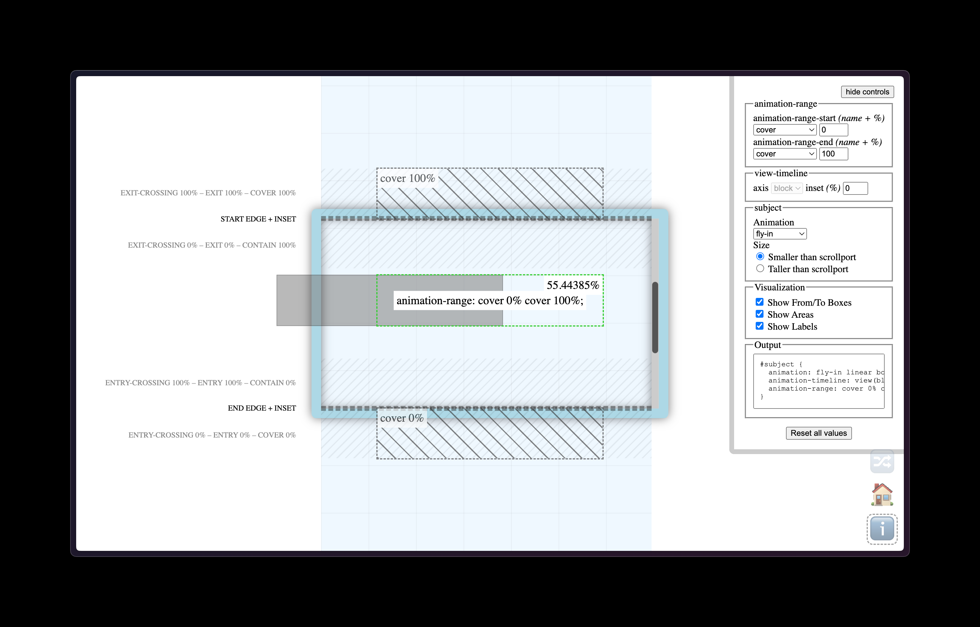
A few weeks ago I mentioned Scroll Driven Animations but forgot to link to this excellent tool called View Progress Timeline that visualizes elements animating on scroll and how to trigger them. Once you’ve made a little demo of the animation you want, it then gives you all the CSS you need to copy/paste into your own project. Fantastic stuff.

This post by Chuan about time-based CSS animations has a ton of bonkers CSS tricks that are worth checking out:
After years of wait, CSS now has enough Math functions supported, particularly mod(), round(), and trigonometric functions. It's time to revisit the time-based way of animation, hope it'll be more useful this time.
Chuan uses these functions to set up a custom variable via the CSS Houdini API and then track the time in milliseconds. So beware, this is pretty wild stuff:
@property --t {
	syntax: "<integer>";
	initial-value: 0;
	inherits: true;
}

@keyframes tick {
	from {
		--t: 0;
	}
	to {
		--t: 86400000;
	}
}

:root {
	animation: tick 86400000ms linear infinite;
}
Chaun also works on css-doodle which is a web component for drawing cool and elaborate patterns. All of this stuff is very much worth checking out!
Here’s a great video course about the power of scroll driven animations by Bramus and he takes what we already know about CSS animations but gets into the nitty gritty new-ness of binding these fancy animations to the reader’s scrolling behavior.
Speaking of which, here’s Bramus writing about them in his ever-so-excellent demo page from a while back:
Scroll-driven animations are a common UX pattern on the web. These are animations that are linked to the scroll position of a scroll container. This means that as you scroll up or down, the linked animation scrubs forward or backward in direct response. Think of interesting effects such as parallax background images or reading indicators which move as you scroll.
What clicked for me in Bramus’s video series is that with CSS alone we can now detect if an element is visible in its “scrollport” and then animate it in or out or upside down. So it’s not just about adding big, fancy (and often annoying!) animations to the page. Instead, I think subtle examples like this stacking card effect is where scroll-driven animations are going to really shine. But that’s just my hunch!
Either way, I’m extremely excited about all this stuff because I think it’ll lead to more performant scrolling animations but it also unlocks untold power for us web designers to make subtle visual changes to the reading experience.
