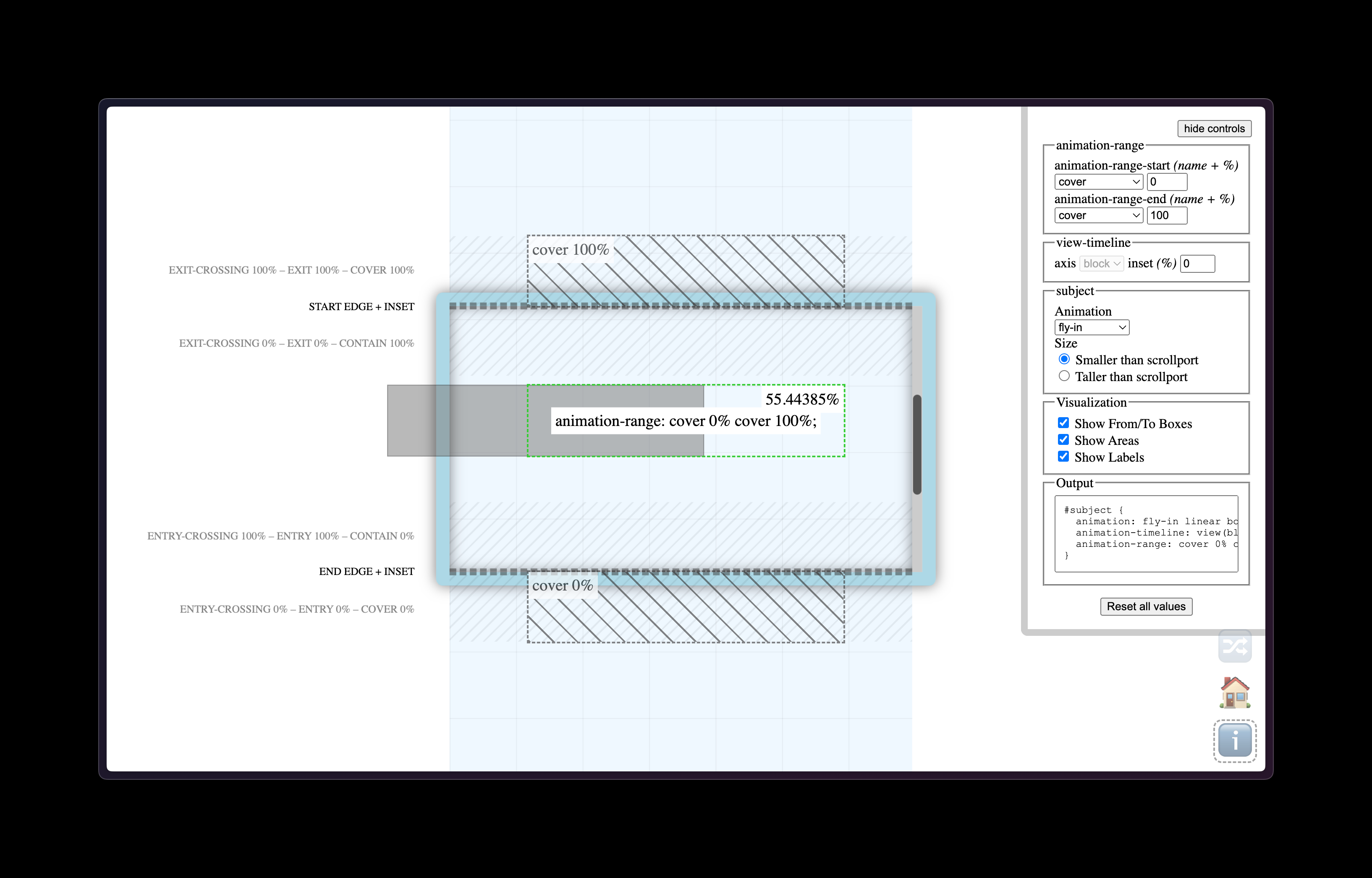
A few weeks ago I mentioned Scroll Driven Animations but forgot to link to this excellent tool called View Progress Timeline that visualizes elements animating on scroll and how to trigger them. Once you’ve made a little demo of the animation you want, it then gives you all the CSS you need to copy/paste into your own project. Fantastic stuff.
Here’s a great video course about the power of scroll driven animations by Bramus and he takes what we already know about CSS animations but gets into the nitty gritty new-ness of binding these fancy animations to the reader’s scrolling behavior.
Speaking of which, here’s Bramus writing about them in his ever-so-excellent demo page from a while back:
Scroll-driven animations are a common UX pattern on the web. These are animations that are linked to the scroll position of a scroll container. This means that as you scroll up or down, the linked animation scrubs forward or backward in direct response. Think of interesting effects such as parallax background images or reading indicators which move as you scroll.
What clicked for me in Bramus’s video series is that with CSS alone we can now detect if an element is visible in its “scrollport” and then animate it in or out or upside down. So it’s not just about adding big, fancy (and often annoying!) animations to the page. Instead, I think subtle examples like this stacking card effect is where scroll-driven animations are going to really shine. But that’s just my hunch!
Either way, I’m extremely excited about all this stuff because I think it’ll lead to more performant scrolling animations but it also unlocks untold power for us web designers to make subtle visual changes to the reading experience.
The other day I made a daft and careless mistake whilst writing about cool queries and specifically this bit of code:
.parent {
	max-width: 300px;
}

.child {
	width: 500px;

	@media (overflow-inline) {
		background: yellow;
	}
}
After misreading the spec and making a quick demo in the browser, I thought I had cracked the problem of being able to detect scrollable containers with just CSS. I assumed what was happening here was that the overflow-inline media query above would detect when the child element was exceeding the bounds of the parent element and then I could change its background to yellow. The demo appeared to work, I had solved the three body problem in CSS, wonderful.
Except, well. It doesn’t work!
Later that same day, Kilian Valkhof wrote up a very good post about why this isn’t the case at all:
Media features say something about the device, and the overflow media feature says something about how the device handles overflowing. It doesn’t say anything about if the page currently is overflowing, just how it would handle overflowing.
Overflow can be used to check how the “device”, or rather the medium in this case, handles overflowing content. On a screen, in most browsers, overflow is going to be “scroll”: If the content overflows, the device deals with that by letting you scroll. But when your medium is print overflow-block is going to evaluate to “paged”. Paper doesn’t scroll, it will continue the content on the next printed page instead.
As Kilian notes, media queries like the one I scribbled above are about the medium, not the page. So this is where I made my fatal and embarrassing mistake that we shall all now politely forget.
Thankfully though, instead of spreading CSS rumors on the internet like I had, back in 2023 Bramus had shown an honest way to detect overflow with—of course!—scroll driven animations. The code isn’t quite as succinct as have a nice little query do the work for us but this does make a bunch of sense to me, even at a quick glance:
@keyframes detect-scroll {
	from,
	to {
		--can-scroll: ;
	}
}

.container {
	animation: detect-scroll linear;
	animation-timeline: scroll(self);

	--bg-if-can-scroll: var(--can-scroll) lime;
	--bg-if-cant-scroll: red;
	background: var(--bg-if-can-scroll, var(--bg-if-cant-scroll));
}
Bramus writes:
For elements that have scrollable overflow, the animation will be active, so the computed value of --can-scroll will be 1. For elements without scrollable overflow, the value will be 0
Fantastic! The whole post walks through this block of code in much more detail and so it’s very much worth reading but this made me sigh a great sigh of relief. I made a little demo where you can add more words to a sentence and see the moment these styles are enabled, too:
See the Pen
Detect scroll with CSS by Robin Rendle (@robinrendle)
on CodePen.
It’s also worth pointing to Bramus’s excellent page of demos for scroll-driven animations. I feel like it’s about time that I dig my heels in and really explore what’s possible since up until now I’ve been ignoring this CSS superpower.